Directive Blogs
Website Editing Guide - Part 2 - Content Formatting Best Practices

The Most Fundamental Website Best Practices Everyone Should Know Before Editing Their Website
Content Formatting Best Practices
Remember writing essays in school, and being taught how things should be formatted?
Did you know that website content has its own set of best practices for formatting your text, and failing to do so can actually hurt the performance and user experience of your website?
In this guide, we’re going to cover how to format your content so it’s web-friendly. This guide should work for essentially every standard website CMS (Content Management System), whether you are using Joomla, WordPress, or some proprietary website builder. In fact, you should take some of these rules when working with standard documents like Microsoft Word or Google Docs, because similar standards apply and can make things much easier for both you and the recipients/readers of your content!
Please note that this guide isn’t a technical walkthrough of how to edit or add content to a particular website or content management system. These are general, fundamental best practices to use and keep in mind when you are working on your website. If you are looking for specific documentation for your website, or for the content management system you are using, please create a support ticket.
What is Content Hierarchy, and Why is it So Important?
Content hierarchy is the strategic arrangement of information on a web page or document. While there are countless ways to structure or arrange your content from a creative standpoint, it’s important to follow some universal best practices to make it as easy as possible for your visitors to digest and understand your content.
Beyond just making it simple for your users to read and comprehend, a strong content hierarchy can make your website more accessible for visitors who are visually impaired and use assistive tools to help them navigate the web. Tools like screen readers depend on websites using these standards to allow a user to quickly and comfortably read, understand, and interact with your website.
Finally, search engines rely on proper content hierarchy best practices to determine what your website is actually about, what makes you stand out, and what you should be ranked for.
Headings and Paragraphs
There are two basic types of text that every web page should have; Heading text, and Paragraph text. Heading text tends to be a larger font that breaks up the content, and paragraph text is your standard body text.
Headings are represented by an H tag, and are either called Heading1, Heading2, Heading 3, or H1, H2, and H3, etc.
It’s important to note that the actual size, font, and styling of the text doesn’t really matter—that’s just aesthetics. What matters is that the text is using proper H tags (the H stands for Heading). This needs to be built into your website, but most modern websites that are built properly should have Headings defined in the CSS.
How to Use Headings
On every page, you should have a single H1 (also known as a Heading1). Your H1 tag is essentially the on-screen title of the page. If you are writing a blog with the title “Top 10 Reasons Why Cardio is Important in Your Forties” then your title should be an H1.
Most good websites do this automatically with your blog posts and general pages, but you may need to consult your web designer in case your website has any quirks or an override field somewhere to enter in your H1. For example, on some sites that have a banner image on every page, you may need to put the H1 text in a field in the Menu Item.
You want to avoid using the H1 tag anywhere else on that page. There should only be one!
You can break up your content on the page further by using multiple H2 (Heading2) tags to divide up the content into sections that are easier for users to skim.
Look at how we structured this section of our guide. The larger text above that says “Headings and Paragraphs” is an H2, and we broke the section up again with an H3 that says “How to Use Headings.” Now, we will use another H3 below this to cover a different concept related to headings and paragraphs.
How Headings Help with SEO
When the search engines crawl a page of your website, they look at all of the content. They look at your headings and assume that the words used in your headings are important and significant to the rest of the content. Your blog post with the title “Top 10 Reasons Why Cardio is Important in Your Forties” gives Google and the other search engines some clues as to what the content is about, and if each of those top 10 reasons had their own H2, Google would be able to parse out the information to help more users find the content when searching for relevant queries.
In other words, always break up your content into smaller, bite-sized chunks of information, and use H2s (and when it makes sense, H3s) to break up your content with clear, concise heading text.
Image Optimization
When working with images in your content, it’s important to optimize them for the web before uploading them to your website.
Images should be saved in a compressed jpeg format whenever possible, unless they require transparency, in which case a png file is suitable.
We have two guides about this:
Working with Images on the Web - Image File Formats
Working with Images on the Web - Resizing Images
Important Things to Think About When Working with Images
- Avoid images with text… unless you absolutely have to, like using logos or screenshots. There are a few reasons for this. One, on responsive sites, images will often get shrunk, or pushed around and covered up on smaller screens. If the image has text in it, it could become hard to read on mobile devices or the part with text won’t even display at all. The second reason is that if someone is visually impaired, that’s text that they won’t be able to read using the accessibility tools within their browser.
- Always resize your images. Photos from modern digital cameras and stock photo sites are always going to be massive, reducing their size will prevent your website from suffering from performance issues and decrease the load times for users, especially on slower connections.
- Be aware of contrast issues. If you are choosing images for banners that overlay text on them, be aware of how text will look when laid overtop your image. If your text is dark and your image is dark, or your text is light and your image is light, it will be hard to read the text. If your text doesn’t contrast enough with the background, it could result in an ADA compliance issue.
What Size Should My Website Images Be?
While we can’t tell you exactly what size your images need to be—that will depend on your website and where you are trying to put them.
How to Tell the Size of an Image That’s Already On Your Website
If you are replacing an image that is already on the website, it’s a good idea to replace what’s there with an image of the same general size. There are a few ways to tell exactly how many pixels wide and tall an image is on your site.
In most cases, you can find that information when looking at the image in your website’s media manager. Both Joomla and WordPress sites will display the image in the media manager/image manager. Typically the image dimensions will be displayed as width x height, and the unit of measurement will be in pixels.
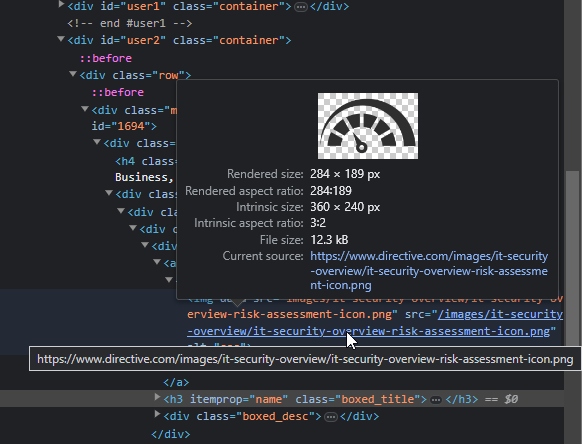
Alternatively, in both the Google Chrome and Microsoft Edge browsers, you can right-click an image and select Inspect.
This will pop up the Inspector window, which will have a lot of information. You are looking for a snippet of code that starts with <img. If you hover over that, or more specifically, hover over the part of the code that has your image path, the inspector tool will give you a small popup that displays the image dimensions.
Adding Alt Text to Images
Most of the images you put on your website should have alternate text. Decorative images (like backgrounds, gradients, separator bars, and other pieces of flair) don’t need alt text. If the image is important to the content, however, it definitely needs it.
Alt text is mostly used for web accessibility. It has three main uses:
- If, for whatever reason, an image does not load on the page, the alt text is displayed in its place.
- Alt text will get picked up by screen readers and other accessibility tools and helps visitors with visual impairments navigate and understand your website.
- Alt text gives search engines additional contextual information about the image.
Depending on the platform you use to manage your website, alt text is usually inputted when you upload an image.
Alt text should describe the image. If the image has text in it (which should be avoided whenever possible, but for elements like logos, movie posters, pictures of book covers, and other images that might have text it is okay) the alt text should be the text that’s within the image.
You don’t want to stuff your alt text (or any part of your content) with keywords. If you use alt text properly, it would thoroughly describe the image and how it relates to the content. If your image is of a graph showing the relationship between the population of frogs in an area over the last 50 years, then your alt text might read “Graph depicting an exponential growth in the frog population from 1960 to 2010.”
Alt text should be around 125 characters or less.
Adding Links
Links can guide your visitors to other pages, both on and off of your website.
For instance, if you are writing a blog post about choosing the best security camera, and have a page that talks about your security camera installation services, it would be helpful to guide visitors there naturally and organically.
Any text can be turned into a link to some other web page. For most platforms, it’s just a matter of selecting the text and choosing “Insert Link.”
You don’t want to simply link content together for no reason, though. Only do it when you think it will benefit the visitor, and keep in mind that putting a link on a page will lead them away from that page—sometimes that can be counterproductive.
You also want to be aware that linking to a different website altogether can sometimes be useful, but definitely sends the user away from your business. If you sell Nike shoes on your website, but link directly to Nike’s online store in your content, you are going to miss out on sales and simply pass users over to your vendor.
One helpful tip is to set links to open up in a new tab or window. This is a setting in most website platforms. This means that when a user clicks on a link, it will keep your website open in the current tab, and open the link in a new tab. Don’t do this with internal links to other pages on your site in most cases, but definitely do it all the time when linking to a third-party website.
Meta Information
Meta information typically consists of hidden information that most visitors don’t see, but might be used by third-parties like social networking sites and search engines, or they might be used with various tools on your website.
The most common meta information are meta keywords and meta descriptions. In some cases, your content management system might have other elements referred to as meta information, such as author names, publish dates, and other elements.
Meta Keywords
Meta keywords aren’t used anymore. Some website platforms will have a keywords or meta keywords field, but the tag isn’t used by any major search engine. The only time it might be used today is if your website has some sort of custom programming that uses it.
Back in the day (we’re talking 20 years ago), search engines would look at the meta keywords to determine what terms a page should rank for. If you wanted your website to rank for N’Sync (yes, it was THAT long ago), then you would type N’Sync into your meta keywords and hope for the best. The search engines have evolved significantly since then, and now use hundreds of different attributes, mostly based on the content on your website, to determine what you should rank for and where you should rank.
Long story short, you shouldn’t spend time putting keywords into your meta keywords.
Meta Description
Your meta description IS important, but probably not for the reason that you’ve been told. A lot of people (and SEO tools) will make you think the meta description is important for your search engine rankings.
The meta description has little to do with how well you rank on the search engines.
However, having a good meta description could help you get more clicks when your page does rank on the search engines.
When you perform a search on Google, all of the results tend to have a snippet of text. Sometimes, that text could be the page’s meta description. Other times, Google generates something or uses text from the page. You don’t have control over which happens.
That being said, if your meta description is well-written and Google decides to use it, you could entice more people to click on your result.
Meta Description Best Practices
Treat your meta description like ad copy. It should be short and to the point, but enthusiastic about the value of the content that is on the page. We recommend your meta description be somewhere between 50 and 160 characters. Think of it like a brief elevator pitch for the content on the page, or a social media post promoting the page. Avoid using special characters, quotation marks, and excess punctuation, and just focus on crafting a very relevant message that might show a potential searcher that your page has the answer they are looking for.
Other Formatting Dos and Don'ts
What if I Want to Change My Font, the Font Size, or the Font Color on My Website?
Avoid doing this when making basic edits to your website or creating new pages, whenever possible.
Your website’s styling, including the fonts it uses, the font sizes, colors, and all of the other font-based parameters are controlled within your CSS files. In other words, there is this centralized file (or files) that the website references so the font is consistent across the entire website, for as many devices and browsers as possible.
If you manually decide to choose a different font for a particular page, you are breaking that consistency.
That’s not the real problem though. The problem is that by manually choosing a different font for an area, you are adding extra code to the page, and you might break the page formatting on some browsers or devices. There are very few web friendly fonts that are installed on every single browser, and if you pull another font from say, Google Fonts, then you are giving your page yet another resource to wait on to load. Finally, it makes it harder to migrate content down the road when it comes to a website design—that font change will persist if the page code is migrated to a new website design, and it will need to be manually adjusted and cleaned up to ensure that it looks good.
Sure, you can make a specific blurb of text use a bright red, enlarged font that stands out, but keep in mind that you only want to do this as an exception, and avoid it in general practice.
If you want to make global changes to your website’s font and styling, we highly recommend you contact your web designer to ensure that it is done cleanly through your CSS.
Avoid Pasting Stylized Content Into Your Website
When you copy and paste text from one application to another, there is a pretty good chance that extra formatting code is going to come along with it. For example, if you’ve made a beautiful Microsoft Word document with tons of text formatting, and you copy that text and paste it into your website, all that extra formatting code might drop into your site as well.
The problem is your website isn’t a Word Document. Web browsers aren’t Microsoft Word. That code isn’t web friendly, and it wasn’t built for your website.
The result might look okay to you, but the extra code might cause your page to take longer to load on some browsers and devices, and it could cause formatting issues.
Most website platforms allow you to right-click in the editor window and give you the option to paste as plain text. This will remove the junk formatting code and just paste in the text itself. You’ll need to format it using the tools your website provides for you, but it will be a much cleaner experience for your visitors.
Avoid Center-Justifying Your Text
Despite what your personal preferences are, you’ll want to avoid justifying your website text. It makes it hard to read for most users and can add weird spacing between the characters and words in a line.
Justifying your text makes it so the left and right sides of each line of text line up, regardless of how many words and characters you use. It might look clean, polished, and professional when you stand back, but for most users, it makes it a little harder to read your content.
You might think “but books, newspapers, and old-timey encyclopedias do it!” but your website isn’t any of those, and your website also doesn’t use the more robust page layout tools that the New York Times uses for their print edition that gives editors more control over how each line of text looks.
Plus, your website is already trying to account for screen size and resolution. Something might look fine on your monitor, but once another user loads it on their device, they will see something totally different. It’s best to keep things simple and avoid justification, especially for larger bodies of text.
Break Up Your Content into Smaller Paragraphs
Avoid big walls of text. It’s hard for users to read. It would be one thing if you were writing a long, dry Wikipedia page for the history of accounting, but you aren’t.
You want your website to be comfortable and engaging, and breaking your text up into smaller bite-sized chunks will help keep the reader moving through your content!
Use Bulleted and Numbered Lists
Bulleted and numbered lists are a great way to display simple lists and make quick points. Here are some ideas for using lists.
- Listing out features of a product or service.
- Displaying a list of specifications of a piece of equipment.
- Listing out things a user might learn if they come to your next webinar or download your guide.
- Walking a reader through steps in a process (use the numbered list for this one).
- Breaking down meeting minutes.
- And so much more.
Use Bold and Italics When it Makes Sense
You can use bold and italicized text to convey emphasis, or to make it easier to skim content to follow along. For example, when writing a tutorial that involves instructions, we tend to use bold text when we are covering the action we want you to take. Here’s an example.
If you want to make a word or phrase stand out in your content, select the text with your mouse by left-clicking and dragging the mouse over the word or phrase. Then, use Ctrl+B on your keyboard to make the text bold.
If you’d rather make your text italic, use Ctrl+Ii instead.
Alternatively, you can use Ctrl-U to underline your text, but you’ll want to avoid doing that, because most people assume that underlined content is a hyperlink.
Fun fact: While you may remember needing to underline the titles of books, films, and other works in school; on the web, the standard is to italicize them!
When in Doubt, Ask Questions!
Most adults weren’t taught the basics on web formatting and content building, and it definitely is a little different than using traditional word processing applications like Microsoft Word. There’s no shame in asking your trusted web designer what the best practices are, or to have them provide a second set of eyes when you produce something for your website.
We’d be happy to answer any further questions you might have, or look over something you’ve put together to make sure you aren’t missing something. Don’t hesitate to reach out to us on live chat, put in a support ticket, or give us a call at 607-433-2200 if you need assistance with your website.
Up Next in This Guide Series
Now that you know the best practices for structuring your content, the next guide will discuss how to structure your URLs and website navigation. This will be critical when making new pages and moving things around on your website.
Stay tuned for Part 3 - URL Structure and Navigation
About the author
Comments
![]()